- Solutions
- All Solutions
- Consent
- Electronic Data Capture (EDC)
- EHR-to-EDC Integration | eSource
- Electronic Patient Reported Outcomes
- Randomization for Clinical Trials
- Recruit | Patient Recruitment Solution
- Reporting
- Share | Mobile Data Sharing for Research
- Services: Study Configuration | Migration | Integration | Training
- Oncology Clinical Trials
- Resources
- Blog
- Events
- About
- Contact
The Anatomy of an eCRF Form
A form (in this case, an electronic case report form, or eCRF) is a digital, usually web-based, questionnaire for collecting data about a study participant. There are many routes data can take into the eCRF: it may be manually entered, piece by piece, by a clinical research coordinator or the participant herself; uploaded in bulk; or transferred from an external data source (e.g. an imaging database) through a process of integration.
Forms hold the data that biostatisticians will analyze to draw conclusion from a study. Given the preciousness of their contents, it’s no wonder that a whole system of required components, controls, and safety features should emerge to ensure that these forms function reliably.

Why “case report”?
In medicine, a case is an instance of a disease or diagnosis. A case report provides a history of the signs, symptoms, treatment, and follow-up of the patients with the disease or diagnosis. Not all participants in a clinical study may have the disease under investigation; control or comparison groups often do not. Regardless the term “case report” persists, in general form, within clinical studies. A “casebook” refers to the completed set of case report forms for one study participant.
Some basic eCRF components and terminology
The form components presented here the basic ones you’ll need to understand before delving further into this guide. The terms, like “item” and “value”, are widely used among data managers, but sometimes with variation. One manager’s item is another’s question. What you’ll call an item label, a colleague may call a field label. The concepts are universal.
Click a name below to learn more.
Calculations and Scores
What do laptops, smartphones, and tablets have in common? They’re all extremely sophisticated calculators. (The word “computer” derives from the Latin term computare, which means “to calculate.”) Electronic CRFs are thus uniquely suited to carry out even the most complex calculations in fractions of a second, often while the user is interacting with the form. Together with skip logic and edit checks, these real-time results enable your forms to collaborate with research coordinators, lending a faultless memory and mathematical power to the task of capturing data.
Here are just a few labor-saving capabilities of today’s eCRFs:
- date calculations
- unit of measure conversion
- clinical measures (e.g. Body Mass Index)
- patient-reported outcome scoring

Math + skip logic = an intelligent form
Calculations performed by your eCRF can do a lot more than transform data. Real-time results, whether displayed on screen or not, can determine the next step the user should take. That step might involve answering an additional item on the same form, or reporting an adverse event. Each of the examples in the form below relies on mathematical operations and conditional logic (covered fully in the next section) to guide action.
Clinical computation in action!
Here are two examples of calculations in forms: one to generate a clinical measure, and one to compute a score. You can learn more about these calculation types and others in the section below the form.
Clinical measure
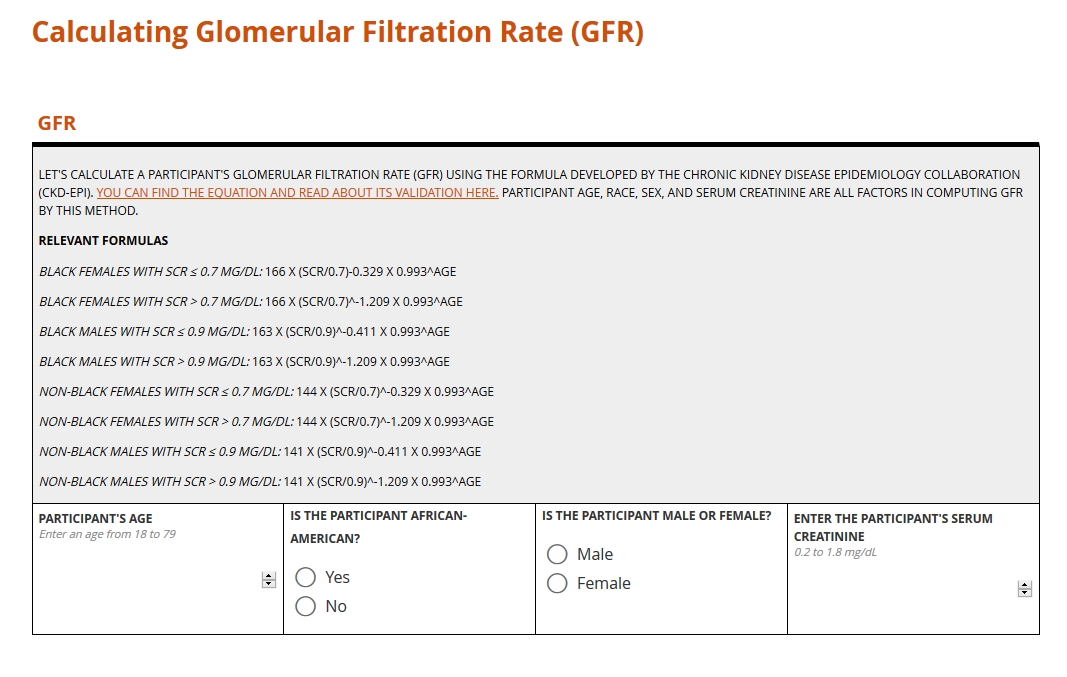
Score

Learn more about the calculation types above
CDISC Data Standards
“You say toe-MAY-toe, I say toe-MAH-toe.” Idiosyncrasies like that are just fine for ordering salad. But when it comes to the interchange of clinical data, stylistic differences are the enemy. Analyses of safety and efficacy depend on comparing numbers gathered from around the world. Without a precise, mutually agreed upon system of conventions (e.g. abbreviations, measurement labels, table layouts), such a comparison is impossible.
For better or worse, the standard for health data has yet to emerge. The types of data that research consumes, from settings as various as the exam room, imaging center, and laboratory, are simply too vast. But a finite number of international conventions are gaining traction. Examples include HL7, LOINC and SNOMED. These and similar standards are beginning to institute a universal way of documenting clinical terms, storing and exchanging electronic data, reporting lab results, and more. When it comes to the collection and aggregation of clinical research data specifically, the biggest game in town is CDISC.

CDISC: Clarity in Clinical Research
The Clinical Data Interchange Standards Consortium (CDISC) began as a volunteer group in 1997, formed to amplify the impact and breadth of clinical research through systems interoperability. What does this mean? Put simply, any research study complying with CDISC standards will produce datasets that are human- and machine-readable by the people and systems involved in any other CDISC-compliant study. Achieving that goal requires a universal way of collecting, labeling, organizing, and exchanging data. Consequently, CDISC prescribes standards for every step in clinical research, from planning the study to analyzing its results.
Get Started with CDISC Standards
You won’t find a “cheat sheet” to CDISC here or anywhere else on the web. Its scope is just too vast. CDISC standards form the many oceans and seas of the research world, and mastery requires nothing less than years of navigation. That said, those seeking to build better forms are well-advised to start with the standards below.
CDASH
(Clinical Data Acquisition Standards Harmonization)
CDASH establishes a standard way to collect data consistently across studies and sponsors so that data collection formats and structures provide clear traceability of submission data into the Study Data Tabulation Model (SDTM), delivering more transparency to regulators and others who conduct data review. — from cdisc.org
The CDASH standard prescribes a universal method of organizing and labeling the data items sought in a study, and of codifying the input. Each data item falls into exactly 1 of 26 domains, such as Adverse Event (AE) or Vital Signs (VS). Responses to these items, if not numeric values, are constrained by codelists whose selection options and names are all standardized. For example, an item asking for the dosing frequency of a concomitant medication (domain of CM) should take as its input one and only one of the following CDISC submission values: BID (twice per day); PRN (as needed); QD (daily); QID (4 times per day); QM (every month); QOD (every other day); TID (3 times per day); UNKNOWN (unknown).
SDTM
(Study Data Tabulation Model)
SDTM provides a standard for organizing and formatting data to streamline processes in collection, management, analysis and reporting. Implementing SDTM supports data aggregation and warehousing; fosters mining and reuse; facilitates sharing; helps perform due diligence and other important data review activities; and improves the regulatory review and approval process. — from cdisc.org
Over the course of a study, you’ll accumulate data item by item, form by form, and participant by participant. The result is a rich but bulky dataset where variables for a given domain (for example, lab results) may be scattered throughout multiple forms from multiple patient visits. When it comes time to submit to the FDA, you’ll need to consolidate and frame all that data according to domain. SDTM guides you in this process. See how CDASH and SDTM are related here.
ODM-XML
(Operational Data Model)
ODM-XML is a vendor-neutral, platform-independent format for exchanging and archiving clinical and translational research data, along with their associated metadata, administrative data, reference data, and audit information. ODM-XML facilitates the regulatory-compliant acquisition, archival and exchange of metadata and data. It has become the language of choice for representing case report form content in many electronic data capture (EDC) tools. — from cdisc.org
Whereas CDASH and SDTM may be applied to paper forms as well as eCRFs, the ODM is strictly a digital standard. It specifies the required elements and format of an xml file that exhaustively describes each entry and update of data in a study. Who entered the value? When and for which participant? Who modified that value, and when? Humans and machines should be able to answer these questions by consulting the xml file.
SDTM
(Study Data Tabulation Model)
SDTM provides a standard for organizing and formatting data to streamline processes in collection, management, analysis and reporting. Implementing SDTM supports data aggregation and warehousing; fosters mining and reuse; facilitates sharing; helps perform due diligence and other important data review activities; and improves the regulatory review and approval process. — from cdisc.org
Over the course of a study, you’ll accumulate data item by item, form by form, and participant by participant. The result is a rich but bulky dataset where variables for a given domain (for example, lab results) may be scattered throughout multiple forms from multiple patient visits. When it comes time to submit to the FDA, you’ll need to consolidate and frame all that data according to domain. SDTM guides you in this process. See how CDASH and SDTM are related here.
Validation Check (Edit Check)
Mistakes happen in the course of data entry. A research coordinator, intending to input a weight of 80 kilograms, leaves the field before striking the “0” key. Her colleague, completing a field for temperature, enters a value of 98, forgetting that the system expects the measurement in Celcius. But no adult enrolled in a clinical study weighs 8 pounds. And the patient with a body temp of 98 degrees Celsius? “Fever” is something of an understatement.
Left standing, errors like the ones above distort analysis. That’s why data managers spend so much time reviewing submitted data for reasonableness and consistency. What if it were possible to guard against introducing error in the first place? With electronic forms, it is possible.
Edit Checks in Clinical Data Management
“Edit checks,” sometimes called “constraints” or “validation,” automatically compare inputted values with criteria set by the form builder. The criteria may be a set of numerical limits, logical conditions, or a combination of the two. If the inputted value violates any part of the criteria, a warning appears, stating why the input has failed and guiding the user toward a resolution (without leading her toward any particular replacement).
Edit checks may be simple or complex; evaluate a single item or a group of related items; prevent the user from moving on or simply raise a flag. You can learn all about these differences below. The goals of edit checks are universal: higher data quality right from the start!

Edit Checks in Clinical Data Management
Setting edit checks appropriately is all about balance. Place too many checks, or impose ranges that are especially narrow, and you’ll end up raising alarms for a lot of data that’s perfectly valid. That will slow down research coordinators who simply want to get you the data you need. Place too few checks, or allow any old values, and you’ll open the gates to a flood of nonsensical data. You or a data manager colleague will then need to address this data with the clinical site after it’s submitted. Wait too long, and you could discover that the site can’t determine what led to the error in the first place.
While there’s no exact formula for striking the right balance, there are guidelines. Any value that could signal a safety issue ought to receive a lot of scrutiny. For example, in a study investigating a compound known to impact kidney function, you’ll want to place careful constraints around an item asking for a glomerular filtration rate. The same goes for measures tied to eligibility or constitutive of primary endpoints. On the other hand, it doesn’t make sense to enforce a value for height that’s within 10% of a population mean. Moderately short and tall people enroll in studies, too!
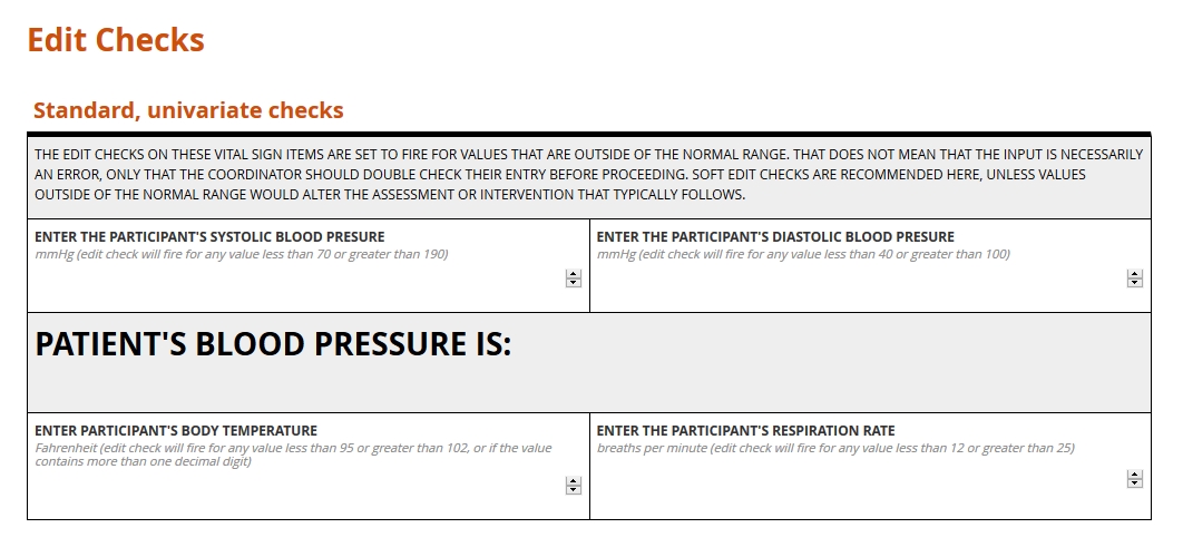
Validation Check Examples
All edit checks share the common objective of cleaner data at the point of entry. They also share a rigorous and logical method. Input is either valid or not, and the determination is always objective. Beyond this family resemblance, though, edit checks differ in their scope and effects.
Hard vs. soft
Hard edit checks prevent the user inputting data from proceeding to the next item or item group. Note that a validated system will never expunge a value once submitted, even if it violates a hard check. Rather, it will automatically append a query to the invalid data. Until the query is resolved, the form users won’t be able to advance any further on the form.
Soft edit checks, by contrast, allow the user to continue through the form. However, the user won’t be able to mark the form complete until the query attached to the check is resolved.
Hard and soft edit checks each have their place. If an out of range value would preclude further study activities, a hard edit check may be justified, as it sends a conspicuous “stop and reassess” message to the clinical research coordinator. Where an invalid piece of data is likely to represent a typo or misunderstanding (e.g. a height of 6 meters as opposed to 6 feet entered on a physical exam form), a soft edit check is preferable.
Univariate vs. multivariate
Univariate edit checks evaluate input against range or logical constraints for a single item–for example, the value for Height, in inches, must be between 48 and 84.
Multivariate edit checks, by contrast, place constraints on the data inputted for two or more fields. “If, then” expressions often power these checks: if field A is selected, or holds a value within this range, then field B must meet some related set of criteria. If a form user indicates a history of cancer for a study participant, a related field asking for a diagnosis will fire its edit check if a cancer diagnosis isn’t provided.
When input fails to meet a multivariate edit check, it’s important for the warning message to state which item values are responsible for the conflict. Suppose a research coordinator enters “ovarian cyst” on a medical history form for a participant previously identified as male. A well-composed error message on the medical history item will refer the user to the field for sex.
Standard vs. protocol-specific
Standard edit checks, such as those placed on items for routine vital signs, do not vary from study to study. Their value lies in their re-usability. Consider a check placed on the item for body temperature within a Visit 1 Vital Signs form; one, say, that sets a range between 96 and 100 degrees Fahrenheit. That check can follow that item from form to form, just as the form may be able to follow the Visit 1 event from study to study. There are no experimental reasons to set a range wider or more narrow than this commonly expected one.
A protocol-specific edit, by contrast, enforces on an item a limit or threshold dictated by the protocol. Imagine a study to determine the reliability of a diagnostic tool for prostate cancer in men at least 50 years old. The eligibility form for such a study will likely include protocol-specific edit checks on the items for participant sex and date of birth. Or consider an infectious disease study whose patient population requires careful monitoring of their ALT value. In this context, a value that’s just slightly above normal may indicate an adverse event, so the acceptable range would be set a lot narrower than it would be for, say, an ophthalmological study.
Univariate vs. multivariate
Univariate edit checks evaluate input against range or logical constraints for a single item–for example, the value for Height, in inches, must be between 48 and 84.
Multivariate edit checks, by contrast, place constraints on the data inputted for two or more fields. “If, then” expressions often power these checks: if field A is selected, or holds a value within this range, then field B must meet some related set of criteria. If a form user indicates a history of cancer for a study participant, a related field asking for a diagnosis will fire its edit check if a cancer diagnosis isn’t provided.
When input fails to meet a multivariate edit check, it’s important for the warning message to state which item values are responsible for the conflict. Suppose a research coordinator enters “ovarian cyst” on a medical history form for a participant previously identified as male. A well-composed error message on the medical history item will refer the user to the field for sex.
Putting the user first
What do we want in a physician? Encyclopedic knowledge, honed intuition, and proven skill, for starter’s. But without a calm and compassionate bedside manner, that physician does far less for their patient than they might. The same applies to forms. All the technical capability in the world means little if interacting with the form causes frustration. The insistence on a great user experience informs every part of this guide. In the section on skip logic, for example, we examined a way of respecting the user’s time. In the section on edit checks, we explored ways to help the user avoid entering invalid data. These are two facets of a positive user experiences, but there are dozen’s more. How should a form look on any given screen? How should we paginate a long form, so that no one screen entails endless scrolling? These design decisions matter. Making them wisely requires carefully considering the user and their environment. The video and article below will show you how to do just that.

Question types (a.k.a item types)
Questions, or items, are the building blocks of your form. Each item is a container for exactly one value, entered by the researcher or participant interacting with your form (or computed by your system from these entries). That value might be:
- a number,
- one or more selections from an array of choices,
- one or more regions of an image,
- a word, phrase, or sentence typed by the user
- an uploaded document or media file,
- or even an electronically drawn sketch or signature.

Value type determines item type
You wouldn’t carry water in a spaghetti strainer. For the same reason, you wouldn’t offer a space for letters if you wanted an integer from your form user. Item types set preconditions for the data they’ll eventually hold. They also tell the database how to store that input.
See below for summaries of the most common value types, along with the various item types used to collect them. When building your form, make sure you choose the right tool for the job!
Common item types
Click for explanation and examples
Integers
Definition
Whole numbers, including zero and negative numbers
Use
In clinical studies, measurements from height and weight to white blood cell counts are typically expressed in whole numbers. “Doesn’t that lead to imprecision? What if the participant is 1.8 meters tall?” Generally, if your study demands greater precision from a given value, your form should prompt the user to supply the value in terms of a smaller unit of measure; 180 centimeters instead of 1.8 meters.
Best practice
Ask for an integer if and only if the value you want represents a quantity. An integer field for body weight makes perfect sense. On the other hand, if you want to know whether a diabetic participant has been diagnosed with type 1 or type 2 diabetes, an integer field that accepts either 1 or 2 is misleading. The numerals here don’t represent quantities, but names. Reserve integers for: interval scales, such as temperature; ratio scales, such as height; and ordinal scales, such as intensity of pain. (Interval? Ratio? Ordinal? See this page for an excellent breakdown of scale types.)
This is box title
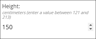
Simple integer field
Integer fields should allow the user to type in a number. For mobile devices, a touch screen widget like the arrows shown here make adjusting a value easy.
This is box title
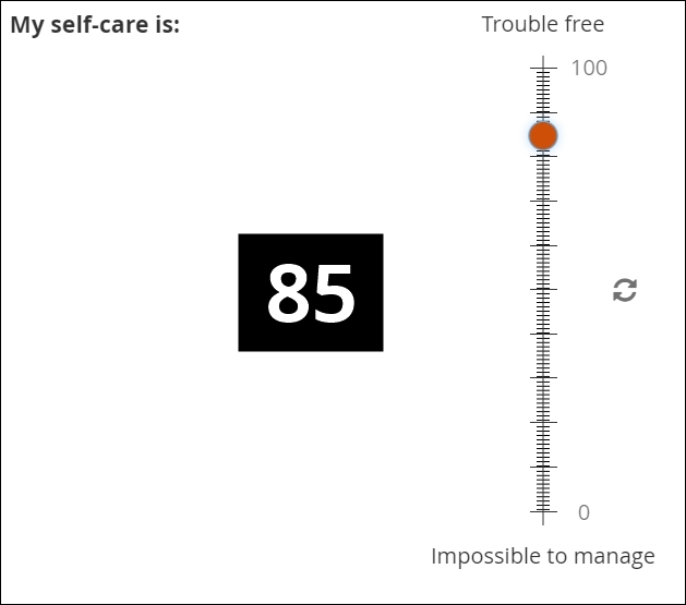
Visual analog scales
A graphical interface can help the user to understand how close their value is to an upper or lower bound. For this reason, visual analog scales are often found within participant-facing (ePRO) forms, to help solicit an accurate response where a question involves some degree of subjectivity (e.g. intensity of pain).

Decimals
Definition
Numbers that may contain a fractional component (e.g. 5.1 or 0.78)
Use
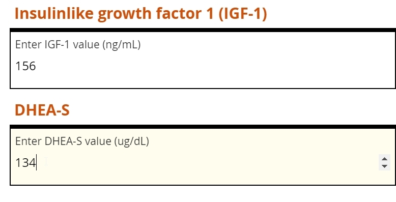
Common among lab values typically expressed in units of 10x, such as a white blood cell count of 4.1 x 10⁹cells per liter of blood. Decimal items will accept whole numbers, both positive and negative, as well as zero.
Best practice
Make sure to check how many digits your EDC will accept in the field, as well as if and how the entered value is automatically rounded when saved to your database. As with integers, decimal fields should be used when the desired input is a quantity.
This is box title
Simple decimal field
The leftmost field below will accept any properly formatted decimal value. The subsequent fields, for white blood cell count, all require a value with exactly one decimal place specified. This requirement is enforced with an edit check, which helps ensure the user isn’t rounding the lab value or inputting a level of specificity that’s not normally associated with WBC measurements.

Single Select
Definition
The selection of one choice from a predefined set of choices
Use
Blood type, cancer staging, presence or absence of biomarker, etc.
You might also prompt the user make a selection from a set of mutually exclusive numeric ranges (e.g. no lesions, 1 lesion, 2-4 lesions, 5-7 lesions, 8 or more lesions). In this latter case, make sure every specific value maps to one and only one range (e.g. don’t offer 2-4 lesions and 4-6 lesions, or 2-4 lesions and 6-8 lesions).
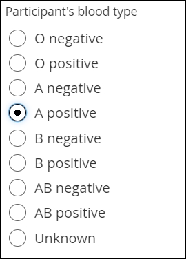
Fillable circles, called “radio buttons,” adjacent to the choices indicate that only one selection is allowed. Note that not all presentations of Single Select feature buttons.
Best practice
Consider including “unknown” or “unavailable” as a choice when you foresee the user not being able to provide accurate input. Otherwise, the user may skip the item, and you won’t know whether they overlooked the item or simply couldn’t answer. Also, use caution if presenting “Other” as a possible choice. “Other” is a notoriously broad category. If you prompt the user to “please specify” their response of Other with freetext, you’ll need a plan to interpret and analyze that text.
This is box title
The two aspects of every choice
Single Select item types (as well as Multi-Select) require the form builder to specify a list of possible choices. Each choice is defined by a label and a name. The label is what the form user sees. The name is the value that gets saved to the database.
For example, an item may ask whether the participant is right-handed, left-handed, or ambidextrous. The words themselves appear on the form. Depending on which choice the user selects, a different name is saved to the database. It is up to the form builder to associate each label with a unique name, which may be a numeral, word, or character string.

Names are usually set as numerals, which are universally readable by humans and machines. For a single item, two choices cannot share the same label or name. (Labels or names may be repeated across items; e.g. ‘1’ means right-handed in the example above, but may represent ‘Yes’ in a different item asking for a response of ‘Yes’ or ‘No.’)
Together, the list of choice labels and choice names for all of your form’s items is known as your code list.
This is box title
Simple radio buttons
Probably the most familiar of “select one” item types. The fillable circles (“radio buttons”) are a web standard meaning “only one choice is allowed”.
This is box title
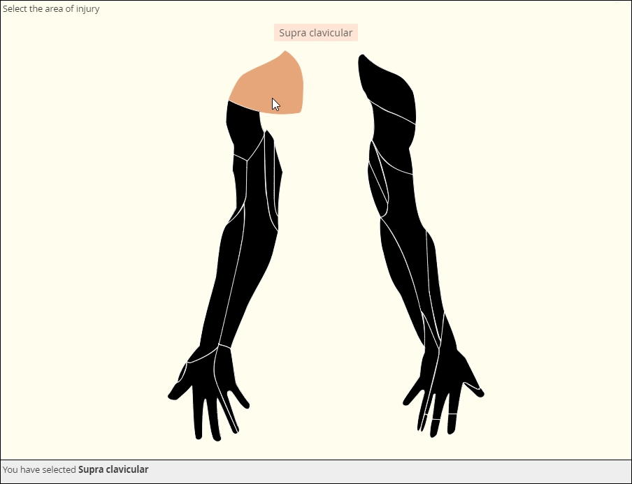
Clickable image map
The image file that makes this item possible is called a Scalable Vector Graphic, of svg. As a vector graphic, its shaped is determined by mathematically defined curves, so the image can “scale up” or “scale down” without losing any detail. The curves and the areas they bound are tagged to individual choices, like the muscle shown here. You can license validated, clinically accurate svg’s or create your own with software such as Adobe Illustrator.
This is box title
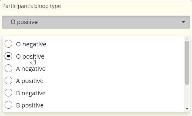
Drop Down
To save vertical space on the eCRF, you may mask the available options until the user activates a drop down menu.

This is box title
Autocomplete
This item scans a predefined list of choices as the user types, showing all and only those choices that contain the character string typed thus far. (Think of Google’s suggested keywords.) Eventually, the user is forced to select one of the choices from the list or leave the field blank. This item type is ideal for very long lists.
In the example below, the response to one autocomplete item (1. Type of Cancer) determines the available choices in the next item (2. Subtype of Cancer). Note that the ‘S’ typed in the second field has narrowed the choices down to cancer subtypes that contain an ‘S.’ This workflow is called cascading autocomplete.

This is box title
Likert scale
Likert scales are intended to record agreement with a statement. (Don’t use them for variety’s sake when a column of radio buttons will suffice.) Five-item scales with one middle or neutral value are most common. There are virtues to Likert scales, such as their familiarity and use of use, but there are also drawbacks, such as overuse of the middle value (central tendency bias).
The data gleaned from Likert scales is simply ordinal. What does that mean? You cannot assume that a respondent who “strongly disagrees” with a statement disagrees with it “twice as much” as someone who merely “disagrees” with it. (That’s a property of ratio scales.)
Multi-Select
Definition
The selection one or more choices from a predefined set of choices
Use
Demographic categories, multiple sites within the body (e.g. regions of the spine affected by bone density loss), etc.
Multi-Select fields are usually distinguished by the use of fillable squares, or “checkboxes,” adjacent to each possible choice. (As with Single Select, though, discrete images or discrete regions of a single image may take the place of checkboxes.)
Best practice
Many of the same considerations that apply to Single Select apply to Multi-Select. Choices should be clear and distinct from one another. Making a Multi-Select item required while offering a ‘none of the above’ choice can guard against users inadvertently or intentionally skipping the item.
This is box title
Simple checkboxes

This is box title
Drop Down
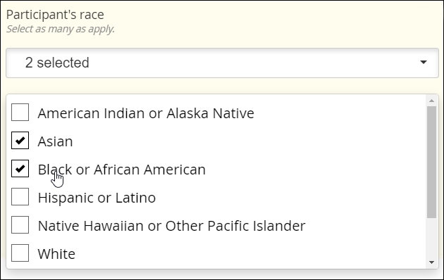
This is box title
Clickable image map
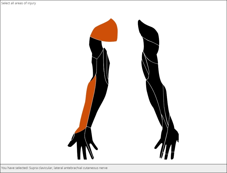
This is box title
Select an image

This is box title
Clickable image map

This is box title
Select an image

Dates
Definition
A year, month, and day-of-month combination (e.g. 2019-06-09)
Use
Date of diagnoses in a medical history, date of assessments and procedures during the course of a study, etc.
The interface for selecting a date may vary from EDC to EDC, but most systems will save the date value to conform with the ISO format of YYYY-MM-DD. The Clinical Data Interchange Standards Consortium (CDISC) upholds this format.
EDC systems optimized for usability will support a calendar widget for scrolling quickly into the past and future. Such systems will also accommodate partial dates, where only a year (or month and year) are to be entered. How these systems accommodate partial dates may differ, however. One strategy is to solicit a 4-digit integer to represent the year, a 2-digit integer from 01 to 12 to represent the month, and a 2-digit integer from 01 to 31 to represent the day of the month. (Depending on the year and month specified, the integer for day of month may be capped at 28 or 30.)
Best practice
Requiring a full date when only a certain month or year are known to a CRC or participant is a major hazard for analysis. If that full date field is required, it’s quite possible that the user will select a placeholder for day of the month–the 1st or 15th, say–when that piece of information is unavailable to her. The value in the database, then, implies a level of specificity that wasn’t intended. To avoid this pitfall, ensure that the individual entering the date indicates which portions are known and which are unknown (“UNK”). Then, offer the corresponding field for input.
This is box title
Calendar widget
An intuitive interface for specifying an exact date, allowing for point and click or hand keying.
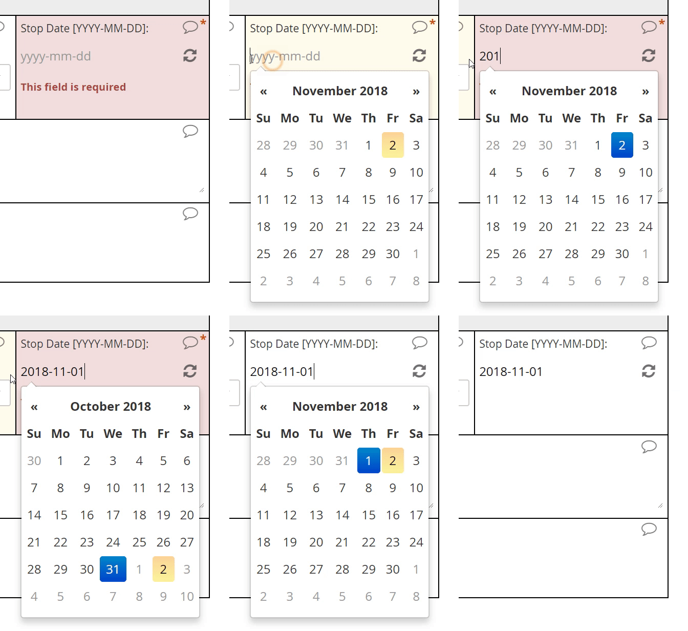
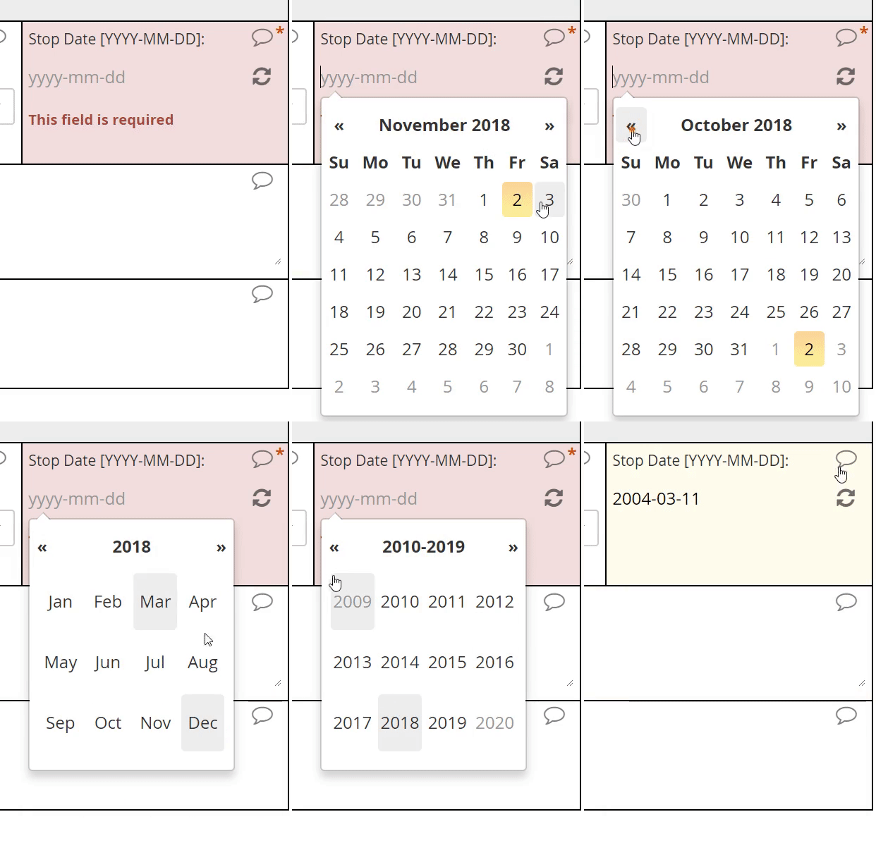
This is box title
Partial dates
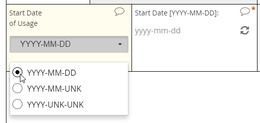
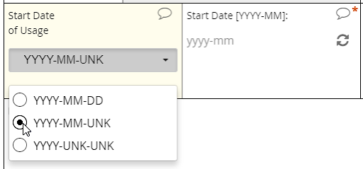
An intuitive interface for specifying an exact date, allowing for point and click or hand keying.
This is box title
Partial dates


An intuitive interface for specifying an exact date, allowing for point and click or hand keying.
Text
Definition
A string of letters, numbers, spaces, and punctuation, from one character to thousands
Use
Summarizing an adverse event, adding detail to an abnormal finding upon examination, etc.
Best practice
Use sparingly! Some contexts, like the two listed above, demand giving the user free rein over their input. Reserve text items for those limited occasions. Of all the value types, text is the least amenable to statistical analysis
This is box title
Text field

File upload
Definition
A mechanism for submitting media and document files
Use
Imaging studies, digital histology slides, scans of paper-based cognitive tests, detailed documentation from adverse events, etc.
A modern web-based EDC will offer fields for submitting files of any type or only those types (e.g. image, audio) specified by the form builder. The EDC should also apply the same stringent encryption to uploaded files as it does to data in other fields.
Best practice
As with free text, use this item type sparingly. The contents of the file do not become discrete elements of your dataset. For example, an uploaded .pdf indicating a history of lab results won’t get represented as an array of dates, analyte names, units of measures, and decimal values; within the dataset, the .pdf is just its own opaque element, represented by the file name. For that reason, you should not use file uploads if it’s possible to collect the same information through form fields.
This is box title
Media Upload
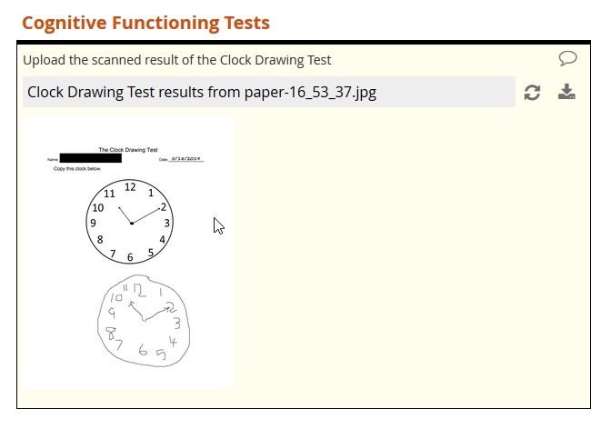
This is box title
Document upload
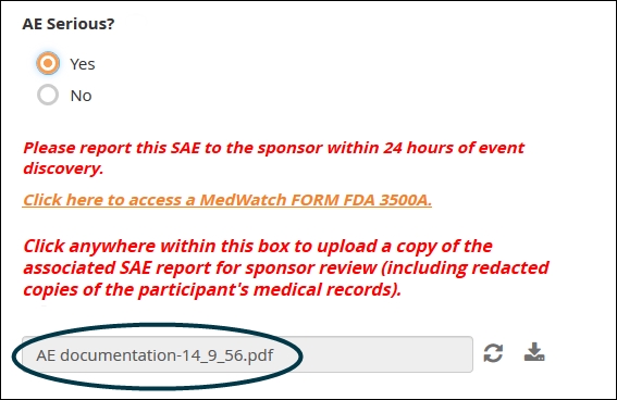
This is box title
Document upload

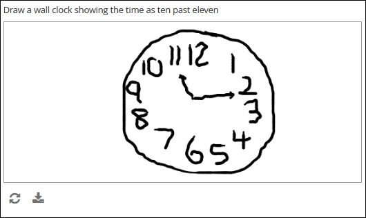
Draw
Definition
A finger-, stylus-, or mouse-drawn picture, created by the form user and saved as a bitmapped image (e.g. jpg or .png)
Use
Electronic-based versions of cognitive tests, annotations of digital photos, signatures, etc.
Best practice
Use with caution if collecting patient-reported outcomes. An electronic version of a drawing-based test traditionally administered on paper is unlikely to yield statistically equivalent results. If you plan on submitting the results for drug approval or academic publication, you’ll need to prove equivalency between swapping one for the other. (This may mean a separate study.) Also note that a digital signature by itself may not comply with the FDA rules for electronic records, described by 21 CRF Part 11.
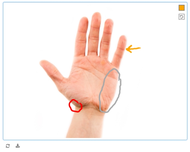
Safer uses of the draw item include study coordinators or clinicians annotating medical photos, where the annotations themselves are meant to provide context and are not the objects of analysis themselves.
This is box title
Draw
This is box title
Annotate
This is box title
Signature

This is box title
Annotate

Skip logic
“Please answer the following three questions if you answered ‘yes’ above.”
Instructions like the above are common on paper forms. A biological male, for example, won’t have a history of pregnancy. Asking him questions on this topic wastes his time, contributes to survey fatigue, and makes him more likely to abandon the form. When a users is forced to chart their own way through a form, the chances of missing a critical question increase. Meanwhile, some portions of your forms will be destined for irrelevance, which is a waste of paper and an encumbrance on the data compiler responsible for sifting through completed and skipped boxes.
Enter electronic case forms with skip logic. As with scores and calculations, skip logic takes advantage of the digital computer’s biggest strength: it’s ability to compute. Here, instead of summing or dividing values, the form evaluates the truth of a logical expression. Did the user either select ‘Yes’ for item one or check the box for ‘B’ on item two? Did she include a cancer diagnosis on last month’s medical history form? (Variables in skip conditions can range over multiple forms.) Form logic can deduce the answer instantly, and behave differently depending on what that answer is: showing or hiding an additional item, further instructing the coordinator or participant, or alerting the safety officer. The results? A better user experience, cleaner data capture, and no wasted screen space!
Combating survey fatigue
Even the most diligent research coordinator can find herself procrastinating when it comes to data entry, only to battle frustration when she does finally attempt to tackle the study’s eCRF. The same is true of patients, who often face the additional challenge of poor health. This resistance to starting and completing forms is called survey fatigue, and it’s very real. Survey fatigue slows the pace of data acquisition and undermines quality, as respondents consciously or subconsciously overlook items or supply their “best guesses” simply to finish the work. As data managers and form builders, we need to consider the respondent’s experience at all times. This includes asking only for information required for analysis and possessed by the researcher or study participant. Never ask these respondents to perform a task more ably performed through form logic and calculation. That includes applying skip logic to ensure that all of the questions we ask are relevant!
This is box title

This is box title
Let’s get logical
Skip logic (also known as branching logic, conditional logic, or skip patterns) is the technical name for a common type of command:
If this is true, then do that; otherwise, do this other thing.
What this refers to may be simple; for example, the user selecting ‘yes’ on a yes or no question. Alternatively, this might be quite complex; for example, the user selecting both B and C, but not D, on item 10 or else responding ‘no’ to at least five items between items 11 through 20. This is always either true or false, depending on whether the input conforms to an expression the data manager has written with Boolean algebra.
Because this is either true or false (and not both), either that or the other thing must occur (and not both). As with the conditions for this, it’s up to the form builder to state what that and the other thing are. Usually, she will try to model the protocol with this conditional command. For example: “Take this measurement. If it falls within this range, take this additional measurement. Otherwise, to proceed to the next assessment.”
The form below provides examples of skip logic with increasingly complexity. See if you can recognize the conditional command behind each one.
This is box title
Boolean algebra: the rules at the heart of skip logic
At the foundation of all digital electronics lie three elementary ideas: AND, OR, and NOT. These are the basic operators of Boolean algebra. But they’re not just for circuit design. Facility with these operators is a must for anyone who wants to design a form that’s truly responsive to input. If you’re new to these concepts, check out this helpful video from PBS LearningMedia. From there, you can learn how to evaluate a Boolean expression for different inputs using truth tables. Finally, you’ll be able to write your own Boolean expressions, even very complex ones, to “program” your form to behave in certain ways based on certain inputs.


