Is there any term in data collection more despairing than “abandonment rate”? That’s the percentage of respondents who start inputting data into a form but don’t complete the task. Sometimes, it’s hard not to take that kind of rejection personally.
Sadly, it’s just one problem among dozens that hinder the collection of timely, clean and complete data directly from study subjects. A participant’s compliance with study procedures (and data entry) is always only voluntary, and apart from the occasional stipend, these participants rarely receive compensation in dollars. That’s not to say that the care provided in the course of a study isn’t of value to patients. But that “quid pro quo” mindset isn’t easy to maintain outside the clinical site. Paper diaries and even electronic forms ask a participant for their time and attention, goods that are in short supply these days. As an industry, we can’t stop looking for ways to minimize the burden on participants. Not if we want to maximize their contribution.
In previous posts, we explored BYOD as a preferred approach to collecting ePRO data. But that’s only half the story. What good are friendly, motivational messages to a participant’s mobile device and computer, if the form to which they’re directed is needlessly long or convoluted? That’s a recipe for heartbreak (form abandonment), or at least a host of trust issues (incomplete or poor quality data).
So, what are the keys to getting your participants to enter all their PRO data, accurately and on time? Not surprisingly, they’re not too different from those we rely on in any budding relationship. Below, I bundle them into four categories.
 Make a good first impression
Imagine yourself as a job interviewee. The hiring manager asks you to rattle off the top three responsibilities in every role you’ve ever filled. How coherent will you answer be? A practiced interviewer, interested in getting to know you, would start differently. “Tell me, what’s your top priority in your current role?” She’ll need to gather a lot more information before the end of the interview, but she’s set out a comfortable pace for getting it.
The lesson for ePRO form design is clear.
1. Start with a single (or very small number) of questions that can be answered simply. Present these one to three questions, and no more, on the first page.
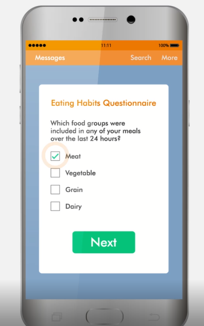
This best practice is one example of a broader rule: always proceed from the simple to the complex. Don’t ask the participant to choose one of sixteen options. Rather, ask two yes or or no questions that will reduce the options first to eight and then four, and have the user pick from that list. Yes, the latter scenario involves more clicks, but it involves less cognitive labor and less scrolling.
Dress to impress
The “e” in “ePRO” isn’t usually capitalized, but maybe it ought to be. Leave the paper mindset behind. Spatial and color constraints no longer apply, and you can present information in a way that prevents the participant from looking ahead (and becoming discouraged). In short, you’re free to give respondents a form-reading and form-filling experience they actually enjoy. Here are some pointers on visual cues that work with the eyes and minds of your participants:
2. Black or dark grey text on a white background is always the safest default for instructions and form labels. For section headings and buttons, a vibrant color that contrasts sufficiently with the background can help orient the respondent.
3. If you have a choice of fonts, sans serif is preferable. Why? While studies do not point to a clear winner for readability in all contexts, evidence suggests that lengthy text passages that ask the reader to parse several ideas at once are best served by serif fonts, while short prompts and labels are best conveyed with a sans serif font. (And you already know that short and direct is best, right?) The wide variety of serifs in existence make character-recognition more difficult to non-native readers, while san serifs are more likely to remain readable when scaled down.
4. Place the field label above, and left justified with, any field requiring the respondent to type. This “stacked” format suits the portrait orientation with which most smartphone users hold their device. Placing the field label inside the field for the user to type over may save space, but it also causes your label to disappear once the user interacts with the field.
5. Avoid grids. There are contexts where a grid layout is preferable; for example, when recording multiple instances of body position, systolic pressure and diastolic pressure for a patient undergoing blood pressure tests. But these are almost always in-clinic scenarios. For the collection of ePRO data, stay within a single column layout.
6. Paginate. One screen containing six questions, or two screens containing three each? All things being equal, fewer questions on more pages is preferable. Why? Clicking next is easier than scrolling. Also, breaking up a large set of questions into two smaller ones reduces the intimidation factor.
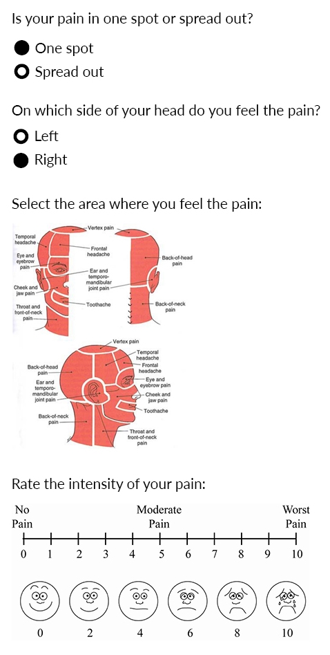
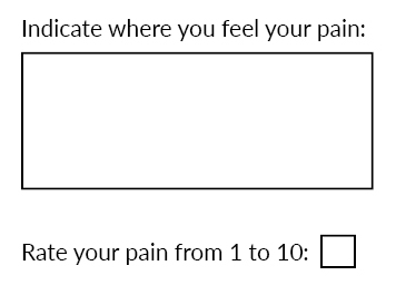
7. Use images as selection options when text could lead to misinterpretation. Not all form engines support this feature, but the ability to present an image in place of (or with) a checkbox or radio button is more than a “nice to have.” Which of the following is more likely to result in quality, computable data?

or…

I’ve relied on a few best practices in this example, starting with some very simple questions in order to narrow down the remaining ones and present them in a manner that gives us clean, accurate, and computable data. But the images in particular are what rescue the participant from needless typing and potential confusion. By making the regions within the head illustration clickable, I can capture very discrete data without taxing the participant’s time.
Respect their time
“Press C to confirm or X to cancel.” That’s a familiar formula to anyone who’s received a text message before an appointment. These are easy to appreciate. If I feel I owe any response to the sender, I’m more likely to complete this pseudo-form than any other.
Chances are, however, you may need a little more data than this from your participants. Here’s how you can gather it while respecting your participant’s time.
8. Minimize the number of fields. This advice may seem obvious and simple, but it’s neither. So long as a participant’s date of birth has been documented once, having them input age is never necessary. And if your system is capturing metadata precisely (e.g. a date and time stamp for every change to a field’s content), then you don’t need to ask the participant to record this information. In general, before adding a field, it is helpful to ask:
- Do I really need this information? If yes, then…
- Can I reliably deduce or calculate it based on prior data? If no, then…
- Do I need the participant to supply it? If (and only if) yes, then include the field.
9. Use skip logic. The phrase “if applicable” should never appear in a form, especially forms designed for participant use. If you are asking the question, it had better be applicable. You can ensure that it is by using skip logic. Has the participant eaten that day? Only inquire about nutritional content for that day’s meals if she responds with “yes”.
10. Use branching logic. Branching logic can help a participant isolate the response she wishes to provide by a process of elimination. Suppose you need a participant to input a cancer diagnosis she had received. Given the wide variation in health literacy, we can’t assume she recalls the formal diagnosis. It may be more helpful to solicit this information through a series of questions easier to answer. Did the cancer involve a solid mass? Depending on the participant’s response, the following question might pertain to an organ system (if “yes” is selected) or blood cells (if “no” is selected). Just five yes or no questions can narrow a field of 32 options down to one.
Doesn’t the use of branching logic conflict with strategy of minimizing the number of fields? These are guidelines, not rules, so trade-offs are sometimes necessary. A drop-down menu showing 32 options may represent just one field, but scrolling through that many selections (not all of which will be visible at once) places an enormous hurdle in front of the participant. The mental effort and time spent scrolling on that one field far outweighs any time savings that might be secured by eliminating three fields. Meanwhile, you’ll have frustrated the participant.
11. Use autocomplete. There’s another way of solving the history of cancer problem above. As long as the participant can recall any portion of the diagnosis when spelled out, autocomplete can help them retrieve the full term. The best instances of autocomplete reveal all matches as the participant types, so that upon typing “Lym” a choice is immediate presented among:
Acute Lymphoblastic Leukemia (ALL)
Central Nervous System Lymphoma
Hodgkin Lymphoma
etc.
The ubiquity of predictive search among search engines like Google makes autocomplete a familiar experience for your participants.
In an era where summoning a taxi or making a credit card payment is a 20-second task, participants will not (and should not) tolerate inefficiency on the web. You are competing with their other online experiences, not just traditional, paper forms. The good news is that you can delight your participants by showing them that even contributing to medical research can be as easy as navigating their favorite web pages.
Show appreciation
You’ve read 85% of this post! Knowing that doesn’t guarantee you’ll read to the end, but it does make it more likely. Regular, responsive feedback is a powerful spur to action. Here are three ways to interact positively with your participant throughout (and even after) the form-filling process.
12. Convey their progress as the participant completes the form. Reflecting back to the participant the portion of the form they have completed and the portion that they have remaining serves two functions. The first is informative. You’ve anticipated the participant’s question (“how much longer?”) and answered it proactively. The second is motivational. Completing even simple tasks triggers the release of dopamine in our brains. We get a neurochemical rush every time we drop a letter in the mailbox or hit send on an email.
You can reward your participant throughout the form-filling process by incorporating a dynamic progress bar into your ePRO form. Every page advance is an opportunity to “dose” your participant, visually, with a bit of happiness.
13. Autosave. Batteries die. Smartphones drop to the floor. Thumbs twitch and close screens. None of these scenarios is justification for losing a participant’s work. Your system should capture input on a field-by-field basis; that is, a back-end process should save the participant’s input into a field the moment he or she leaves that field for another. If a participant abandons a form and then returns to it, he or she should be able to resume where they left off. If you can signal back to the participant that their input has been saved with each field transition, all the better, as this leverages the same psychological power as the progress bar.
14. Show gratitude. Imagine a campaign staffer asking you a series of questions about your views over the phone. You answer the last question and he or she hangs up without so much as a goodbye. Chances are, they’ve lost your vote on account of rudeness alone.
Don’t let this happen to your participants. When they submit a completed form online, they should immediately receive a “thank you” message that is specific to the task they have just completed.
Ensuring the optimal experience for participants supplying ePRO data is more than courtesy: it’s a critical measure for maximizing data quality, quantity and timeliness. So commit to dazzling the people who matter most in your research. Because, as in all relationships, you get back what you give. Click here to learn more about participant friendly ePRO from OpenClinica.
Resources
https://www.formassembly.com/blog/web-form-design/
https://www.ventureharbour.com/form-design-best-practices/
https://www.nngroup.com/articles/web-form-design/
